In today’s competitive market, it’s crucial for any online marketers to have a website that actually converts and transforms all the leads into potential customers. As you know, this is often the hardest part to accomplish because it requires a lot of effort and time.
Your website is a true representation of your entire business. If it looks sloppy and your visitors just can’t get any benefit out of it, they will just leave and forget about you. But if you’ve a conversion focused and a beautifully designed site; showing how your products and services can benefit others, then your website is almost a guaranteed success.
So in order to increase your odds of capturing more leads and generating more sales, I thought of sharing with you the 5 proven tactics you can apply to improve your website. These changes will make all the difference between a winning website and a flop.
#1: Publish Good Content And Make It Look Good
First of all, you need to make sure that you get the attention of each prospect that visits your marketing website for the first time. So how can you do this?
People are always attracted by beauty and this makes no difference when it comes to your website. Just think about your personal preferences for a second here – whenever you’re searching for something on Google, you probably check out different websites to see which one is able to offer you the best solution or answer right?
Let’s say you click on 2 of them. While the first one uses a small font, mismatched color combinations, and you just need a magnifying glass to consume the content, the second one look more appealing, with a clear navigation that suggest where you might find the solution you’ve been looking for. Which site you’ll most likely stick to?
So, not only you need to have good content on your website, you also need to make your website look good. Here are a few tips on how you can achieve that…
- Use sub-headings to break up your content (easier to read)
- Use short paragraphs. Avoid using large blocks of text
- Use relevant images that represent your business and offer
- Use boxes or bullet points to highlight something important
- Be consistent in your content formatting (font size, text color)
Here’s a home page layout I recently designed for small businesses using OptimizePress.
A beautifully designed and properly formatted website will make a huge difference to your business growth than you probably thought. Your business will look more credible, plus people are more likely to share it with others – meaning more traffic (free) to your website!
#2: Make Your Website Load Faster
According to Kissmetrics, 40% of your visitors have already abandoned your page if your page takes more than 3 seconds to load. The average visitor just has no patience for a page that takes too long to show, and justifiably so. Find out more about the stats here.
Here are a few quick facts for you to chew on…
- 79% of visitors hardly return to a slow website
- 100 milliseconds delay caused a 1% revenue loss for Amazon
- 15% boost in overall conversion rates for WordStream after speed optimization
- Estimated $3 billion in yearly lost sales for online retailers due to slow websites
- A one second delay in page response may lower your conversion rate by 7%
And if these statistics still don’t mean anything to you, just think about yourself again – how you behave when you are on a slow loading website?
This is why it is so important to make your website loads fast. But how can you increase your website loading time, prevent visitors or potential customers from hitting the back button, and actually look at what you have to offer to them?
Here are the 5 things you can do for speed optimization…
- Use a fast and lean WordPress theme
- Only use high-quality (updated) plugins
- Reduce the number of plugins on your site
- Run your site on good (fast) web hosting
Running your business on a sluggish website is like driving a car with the handbrake on. You can still arrive at your destination, but it’s such a massive waste of energy.

#3: Use ‘Annoying’ Opt-In Forms To Build Your List Faster
For most online businesses, building a mailing list is the most fundamental thing to do because here’s where you can turn your first-time visitors into repeat visitors, loyal fans, and possibly long-term customers without having to convince them in the first place.
The key to building your list faster is to start implementing ‘annoying’ opt-in forms on your website. It may be a harsh truth to swallow, but you need to understand this – it has been proven that instrusive opt-in forms generally convert better than the less intrusive ones.
If you think about it, the typical sidebar opt-in is very unobtrusive. It just stays there and very easy to ignore; whereas a screen filler that suddenly pops out and fills the whole screen in your face, demanding your immediate attention… it’s kind of annoying right?
Of course nobody wants to annoy their visitors. The way you should think about this is – the opt-in offer that you make has to be a GOOD OFFER. As long as your offer is good enough, then that’s actually welcome. You can, and should try ‘annoying’ opt-in forms.
Here are the 5 commonly used ‘annoying’ opt-in forms…
- Popover: Pop-up form that pops front and center on your page
- Full Screen: Form that takes over the whole screen on your page
- Side: Form that slides into view at the bottom corner of your page
- Bar: An attention bar at the top or bottom of your browser window
- Intro Optimizer: Form with a few navigation options over the top half of your page
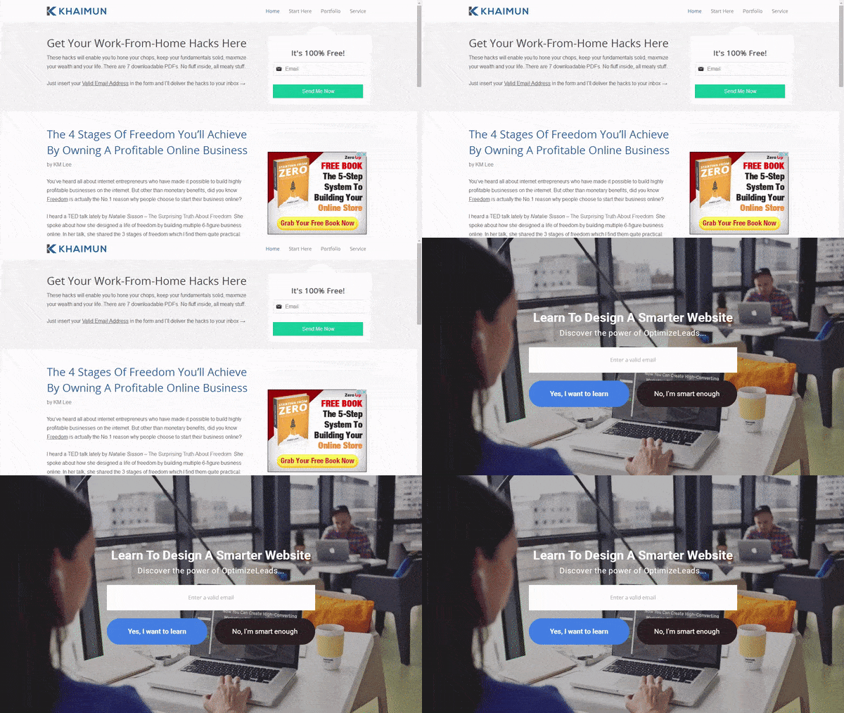
Below is an example of a full screen opt-in form I created created using OptimizeLeads*.

Notice how the opt-in form fills the whole screen of the browser window
*You can get access to OptimizeLeads when you’re a member of the OptimizePress club.
#4 Engage Your Audience
Once you’ve a mailing list, you need to know what you’re going to do with it. There’s no point in having a huge list if you don’t know how to monetize it. It’s far better to have a smaller list with just a few hundred subscribers that actually open and read your emails than a list with a million subscribers who don’t care about what you send to them.
[Website traffic, Mailing list, Social shares, etc.] – [Engagement] = NOTHING!
So you really need to think about what comes after the moment a new subscriber opts-in. They should get a confirmation message with instructions on how to get your offer. Make this process simple and smooth. Once people download your offer, let people know they could connect with you on social media. Offer people the personal branding touch.
An email reply from my customer expressing appreciation to my personal touch
Maintaining a good, natural, and frequent communication with your subscribers is crucial. People don’t like to be sold, but they like to buy. Always strive to provide value to your subscribers. Show people you’re the expert in your industry and you actually know your stuff. People are more likely to be your customer once they know, like, and trust you.
#5 Do Your Own Test To See What Works Best For You
Once you’ve implemented the 4 tactics above, you need to measure the results of your site. While a page with a huge red headline, video, and call-to-action button may convert well in the online marketing space, it may not necessary work for your business.
This is because every audience is different, every website is different, every opt-in offer is different… that’s why it’s important to do your own testing. Right now there are so many tools available out there that allow you to easily run your own split test experiments.
Here are 5 elements you can split test on your page…
- Test a few versions of headlines and subheadlines
- Test different types of header images (hero images)
- Test different button colors, sizes, and texts
- Test different types of opt-in forms, and form fields
- Test different content length, long copy vs. short copy
Once you get into the habit of always testing your page against each other – first, you’ll find all kinds of interesting stuff; and over time, your conversion rate will keep improving. Just think about how far ahead of the competition you could be in a few years’ time? Think about how much of a competitive edge you’ve over your competitors who don’t test.
So there you’ve it. Now it’s time for you to implement these tactics into your marketing website. If you’ve anything you’d like to add, please comment below and let me know.
