In my previous post, I answered some of the top FAQ’s that existing customers have on mind about OptimizePress 3.0. In this post, I’m going to share with you the 5 things you need to know when building your page with the new OP3 page builder. Let’s get started.
#1: Hierarchy Of The OptimizePress Lightning Builder
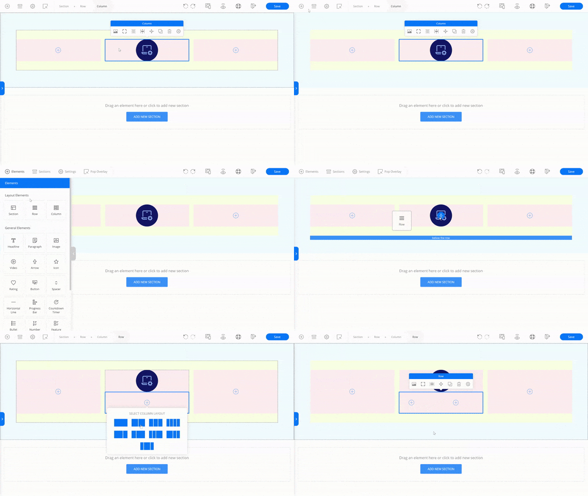
This is by far the most important thing you need to know when you’re building your pages using the OP 3.0 page builder. Unlike OP2 which only deal with Row and Column layouts, this is how the basic hierarchy looks like in OP3 (refer image below for the colors):
- Section: Think of it as a piece of land in the town. The section represents that land.
- Row: This is similar to a development plan. How are you planning to use that land?
- Column: This is where the properties (elements) are built on that piece of land.
Of course, this is just a simple analogy. Things will become a little more complicated if you want to build a more complex layout, e.g. it’s possible to insert a new Row into an existing Column so that you can have a different column layout within the Column.

Adding a new Row into a 3-Column layout to create a new split layout
TIP: It’s easy to get lost, especially when you’re building a more complex hierarchy. You can refer to the top navigation to know which layout element you’re working on. You can also click ‘^’ Focus Parent Element from the inline toolbar editor to know where you at.
#2: Spacing Around The Layout And General Elements
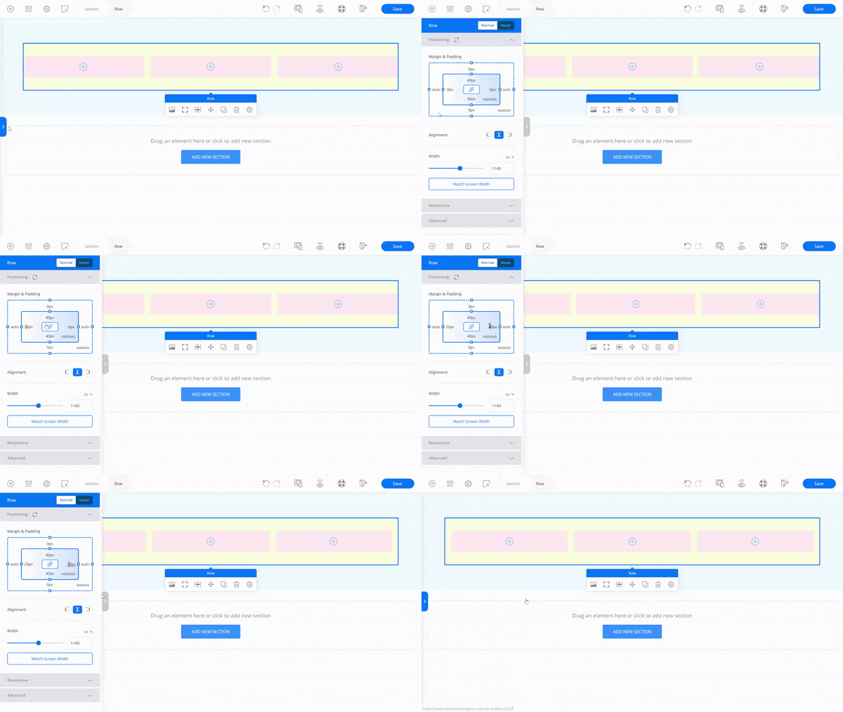
Even though the lightning builder offers inline editing experience, there are times when the sidebar can come in handy. It’s a good practice to refer to the Margin and Padding interactive diagram whenever you adjust the spacing around a layout/general element.

Modifying the left and right padding of the Row at the sidebar
You may have noticed that the only way to adjust the left and right margin/padding of an element is via the diagram (click cog icon Advanced Settings → Advanced Options).
#3: Adding Your Theme’s Header And Footer
Unlike OP2 which have its own header and footer navigation, the new OptimizePress 3.0 actually uses the header and footer from your WordPress theme (cool?). However, this is NOT the default setting when you’re building your pages in the lightning page builder.
To activate the header and footer on your OP3 page, you need to change the WordPress page template in the Page Attributes section. Here’s how you can do it:
- In WP Dashboard, go to Pages → All Pages and click the Edit link under the page.
- On the right, look for the Page Attributes meta box. Under the Template drop-down list, select OP3 – Full Width Template. Remember to Save the setting.
TIP: If you don’t see the Page Attributes meta box, you can enable it by going to Screen Options at the top right corner, then check the Page Attributes check box. You can also change the Page Template easily by going to Settings → Page Settings in OP3 builder.
UPDATE: In OptimizeBuilder version 1.0.9, you can now add the WP Menu element on your pages. You’ll be able to easily create a header menu to your liking.
#4: Adding The Elements Into Your Blog Posts
Besides pages, you can also incorporate the OptimizeBuilder elements into your blog posts just to touch up your blog content a little. Here’s how you can do it:
- In WP Dashboard, go to Posts → All Posts and click the Edit* link under the post.
- If you’re creating a new blog post, then click the Add New button. Give your post a title and save it as either Draft or Published.
- Click the Big Blue Edit with OptimizePress button to launch the OP3 builder. You can insert any of the layout/general elements into your post.
*Please note that you can’t use the WP Gutenberg editor alongside with OptimizeBuilder.
#5: Mobile And Tablet Optimization In Real Time
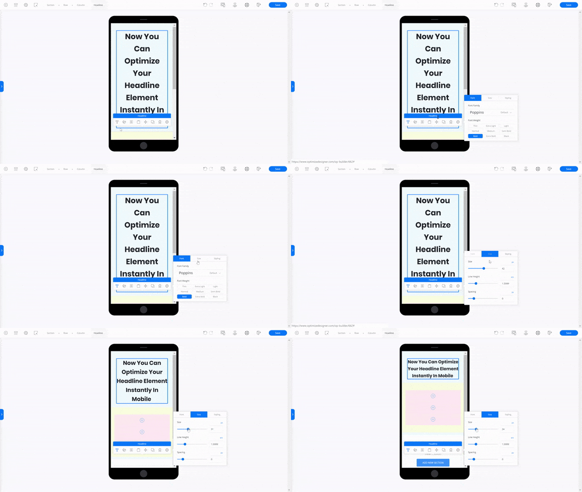
The new OptimizePress 3.0 allows you to effortlessly customize your page to look good on desktop, mobile, and tablet all at the same time. If you’ve been using OP2 for a while, you’ll know how strenuous it is to make your page look good on mobile or tablet device.
With OP3, you can instantly optimize your pages in the editor. All you have to do is simply switch the Device Mode (Desktop/Tablet/Mobile) you would want to edit your page with.

Optimizing the Headline element in mobile preview mode
TIP: You can further optimize the Column element by going to the Responsive tab (click cog icon Advanced Settings → Advanced Options). From there, you can Wrap, Stack or even Reverse the specific column you’re working on – all done with a few mouse clicks!
That’s all I have for you. Of course, there are a lot MORE things I could share, but these are just the essential ones I think you should know when you start using the OP3 builder.
If you’re interested to see how fast and flexible OptimizePress 3.0 is, you can watch the step-by-step video (12:35) below where I built a quick landing page starting from scratch.
